I N T E R I O R S P A C E S || T H E F A I R V I E W

Some people look for a beautiful place, whilst others create a beautiful place.

A fusion of Mediterranean design with minimalist and luxury, creating a harmonious, stylish open plan living space. A natural colour palette complemented by state of the art finishes and furnishings, it’s all about the attention to detail. The Fairview is located in Arncliffe, NSW Australia.

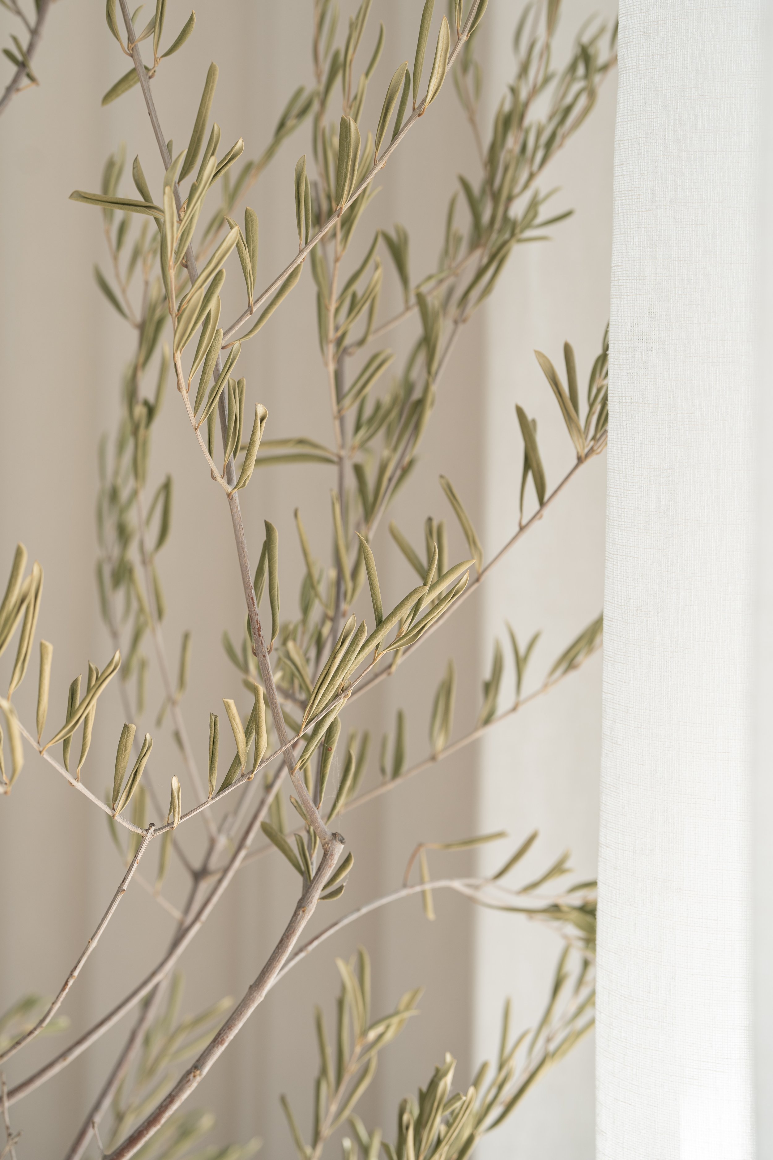
Natural light transforms any space and it is evident so in this beautiful space. The natural light beams through, evenly dispersing the light and bouncing it off the interiors, it’s simply stunning.

I approached this Interior Photography Project blending lifestyle, editorial and architectural photography. It’s important to get wide and capture the whole story, however, it’s just as important to come in close, showcasing the attention to detail.

The Fairview Details

Build & Design @aestheticdevelopments_

Interior Design & Furniture Curation Collaborated between @aestheticdevelopments_ & @alchemystudio_

Photography @visualco_


Evolve Industry Summit || 2024

Brand Photography

Monday 26th February 2024, Evolve Hair Concepts held their Industry Summit at the Kirribilli Club, and I was asked to talk on behalf of Visual Co. covering the topic of Brand Photography. Photography is what I live and breathe so I was honored to be able to take the opportunity to share my passion. However, it was a great big step out of my comfort zone!


And what I’ve learnt throughout my life is that despite the fear that causes my hands to shake and my knees to tremble as I finally take that first step - it’s worth it. And whether this leads exactly where I’m hoping or goes somewhere I can’t imagine right now, I know that in the end, I’ll be glad I came.
— Zanna Keithley

Irene led the talk covering Leadership and Productivity. Emily from Northcott and Co. and I followed up with “All things Visual!”. We covered Visual Merchandising, Brand Photography and Social Media. With a short break, we were then met with Jan and Maureen from HABA. Followed by Danielle Tedesco from TAFE and finishing up with the Guest Speaker, Sharon Blain. There were so many take aways, it would be hard to note them all.

It was inspiring to be in a room full of passionate creatives, talking all things Industry, Education, Salon and Creativity.

Creativity is just connecting things. When you ask creative people how they did something, they feel a little guilty because they didn’t really do it, they just saw something. It seemed obvious to them after a while.
— Steve Jobs

Flash Photography with Kera

What an epic session it was diving into the world of Flash Photography!

Highlight: Capturing that drip shot!

The location of the shoot was down in the heart of the Sydney CBD at Hustlers.Syd, Underground Restaurant & Bar. They have a fusion of South-East Asian Cuisine drawing inspiration from their own family traditions but adding an element of a contemporary twist. The atmosphere was amazing and the decor was dark and moody with minimal natural lighting, an ideal location to immerse into Flash Photography.

After a quick run down on a few house keeping topics, we dived straight into it.

Kera had two lights for us to experiment with, the Profoto A2 and the B10plus (now thats what i call a flash!). She then introduced me to the Modifiers, how to use them and which ones to use to help create different looks. You can achieve difference distributions of light using the Umbrella or the Softbox. The Umbrella has a more rounded spread of light and produces more shadows, whereas the Softbox produces a more softer light. They are both great, it just depends on what look you are after.

Angles, there are three main angles that you shoot food and drink photography. The first is Front on, line it up straight and centre (noodle caption above). The second is a Flatlay, which is like looking down on the dish from a birds eye view (the four dishs) and the third is the from a 45 Degrees angle (the cauliflower dish). All effective but again used to create different looks.

We finished off the shoot with a Drink session and our aim was to capture motion, that drip shot! We used the Softbox to help create the soft light and we were mindful of the reflection on the glass from the light source. Overall it was amazing and i loved every minute of it.

The 7 Princilpes of Design

As Creatives, it’s all about mood boards and design elements as we collaborate our resources to prepare our plan of visual communication.

I have found the following Design Principles are a great go to when we are Merchandising & Styling.

  1. Contrast: Think opposite ends of the scale e.g black & white, old & new, big & small. They all sound so simple yet make a profound difference when Merchandising. Some speak louder than others so always be mindful when using these bold differences.

  2. Emphasis: What do you want to speak the loudest? Your reason for this may vary, you have new stock and ordered a large quantity or it maybe a pre-sale and you want to generate as much interest as possible, it varies for everyone. Just be clear about what it is that you want to stand out.

  3. Pattern: The human eye has a great ability to process the nature of patterns, whether we realise or not. A pattern is usually compromised by a repeating element of Design drawing our attention and capturing the details. A great resource when styling and Merchandising.

  4. Repetition: This is one of favourites, I love the subtle, yet prominent effect it has. It doesn't matter if we are using colour, lines, forms or shapes, the repeated use of these elements brings the entire frame together to make it more meaningful.

  5. Movement: It’s the details that keep the viewers eye engaged and travelling across work work. So when we say movement is not always the literal sense, interesting right! As a photographer I also like to reference examples like the golden ratio  and the rule of thirds, a great representation of how the predicted eye travels across a scope of work.

  6. Space: We have space in between and the "hero" space, this all comes down to positive and negative space. Positive space is where you put all your important pieces whereas the negative space is the space in between. They are both equally important and if used well, have have a profound impact on your displays.

  7. Balance: Think of visual weight and the impact of its composition. Symmetry is one of the most common types of balance, where two halves of a scene perfectly balance each other out. When Merchandising I've realised that I default to symmetry, not always intentionally but I do live the end result. Everything lines up so well and is so pleasing on the eye. Proportion and scale are also related to the balance principle of design, again another eye pleaser.

    Summary: If you sit back, you will probably realise that you naturally gravitate to some, if not all, of these Design principles when Merchandising & Styling. They all play an important role when creating beautiful spaces to help engage with your viewers.